Version 2.2
Added
- mouseover zoom option (default is disabled)Version 2.1.3
Bug Fixes
- skipping content when zoomed using double tap or zoom buttons
- ghost image when dragging thumb scroller
- not scrolling sometimes when already zoomed out
Changed
- typo in the guide. touchnswipe.min.css to pinchzoomer.min.css
- typo in the pz_options.html. removed {} in the generated HTML in the data-options
Version 2.1
Added
Options
- zoom to Marker option (default is disabled)
- drag limit to center (default is disabled)
- scroll page when content reaches its drag limit (default is disabled)
- "smart" value for scaleMode option
- initZoom
API
- transform function
- zoomToMarker function
Feature
- marker tooltips now included
Examples
- Dynamic Options
- Add or Remove Markers
- Multilayer Zoom
- Map with Markers
Removed
- mousewheel plugin dependency
Changed
- The content keeps the zoom factor when window is resized or device changes orientation
Version 2.0
Added
- Support for HTML content (not just images)
- Use of native scrolling when content is not zoomed
- Markers
- Native fullscreen
- Adaptive image loading
- More examples using API
Removed
- Support for IE8 and below and Android 2.2.x (for IE8 and below and Android 2.2.x support use version 1.x)
- Modernizr(No longer required)
Changed
- Improved API for events, content manipulation
- Content options
- Controls are always visible for improved performance
| Javascript File (in js folder) | Description | Required |
| jquery-1.11.3.min.js | jQuery source - http://jquery.com/ | yes |
| hammer.min.js | handles touch events - http://eightmedia.github.io/hammer.js/ | yes |
| TweenMax.min.js | handles animation - http://www.greensock.com/ | yes |
| jquery.pinchzoomer.min.js | main script | yes |
| tooltipster.bundle.min.js | tooltip plugin - http://iamceege.github.io/tooltipster/ | no (but must be included to enable tooltips) |
| CSS File (in css folder) | Description | Required |
| pinchzoomer.min.css | main CSS file that defines zoom buttons | yes |
| tooltipster.bundle.min.css | main CSS file that defines zoom buttons | no (but must be included if tooltip plugin is added) |
| Image File (in assets folder) | Description |
| preloader.gif | default preloader image |
| pz_sheet.png | image sprite containing control images |
<link href="css/pinchzoomer.min.css" rel="stylesheet">
<script src="js/jquery-1.11.3.min.js" type="text/javascript"></script>
<script src="js/hammer.min.js" type="text/javascript"></script>
<script src="js/TweenMax.min.js" type="text/javascript"></script>
<script src="js/jquery.pinchzoomer.min.js" type="text/javascript"></script>
<div class="zoomHolder">
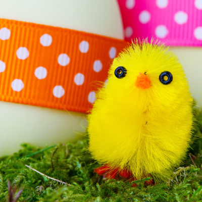
<img data-src="assets/easter_chick.jpg" data-elem="pinchzoomer"/>
</div>
CSS
.zoomHolder
{
   width:100%;
   height:auto;
   position:relative;
   overflow:hidden
}
<div class="zoomHolder"> <div data-elem="pinchzoomer">CSS
<img id="streetLayer" data-src="assets/street_layer.jpg" data-elem="bg" class="layerImg"/> <img id="buildingLayer" data-src="assets/detail_layer.png" class="layerImg"/>
</div> </div>
.zoomHolder
{ width:100%;
height:auto;
position:relative; overflow:hidden }
.layerImg { position:absolute;
left:0px;
top:0px;
right:auto;
bottom:auto; }
| Option | Default Value | Description |
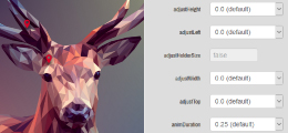
| adjustHeight | 0.0 | valid value is any number. Adds to the height of the content |
| adjustLeft | 0.0 | valid value is any number. Adds to the left position of the content |
| adjustHolderSize | true | valid value is true or false. If true, it will adjust the size of the content holder to fit the size of the content when scaleMode value is widthOnly or heightOnly. This is useful because there will be no need to specify the width or height of the content holder. It is recommended to set this to false if width and height of the content holder is set. |
| adjustWidth | 0.0 | valid value is any number. Adds to the width of the content. |
| adjustTop | 0.0 | valid value is any number. Adds to the left position of the content. |
| animDuration | 0.25 | valid value is any positive number. This determines how long (in seconds) is the animation. |
| allowCenterDrag | false | valid value is true or false. If true, it allows dragging to the center of the content holder. This works best with zoomToMarker enabled. |
| allowDrag | true | valid value is true or false. If true, it allows dragging the content when it is larger than its div holder. |
| allowHoverZoom | false | valid value is true or false. If true, it allows zoom when the mouse is over the content. Note that this will disable mouse drag, mousewheel zoom and double click zoom on desktop but pinch to zoom and touch drag will still work on mobile devices. |
| allowMouseWheelScroll | false | valid value is true or false. If true, it allows mousewheel to page scroll when on top of the zoom content |
| allowMouseWheelZoom | true | valid value is true or false. If true, it allows mousewheel to zoom the content |
| allowZoom | true | valid value is true or false. If true, it allows content zooming. |
| appendControlHolder | true | valid value is true or false. If true, zoom control holder is created and automatically added on top of the content. |
| appendControls | true | valid value is true or false. If true, zoom controls are created and automatically added on top of the content (or the control holder if it is available). |
| crop | true | valid value is true or false. If true, overflow:hidden will be added to the style of the div holder of the zoom content. |
| doubleTapZoom | 2 | valid value is any positive number. This value is the scale when the image is double tapped or double clicked. |
| dragStep | 10 | valid value is any positive number. This determines how much in pixels you want to move in the image when moveLeft(), moveRight(), moveUp(), moveDown() functions are called. |
| force3D | auto | valid value is true or false or auto. If true it will force the content to use 3D acceleration. If value is auto, it will use 3D acceleration while zooming or panning and resets removes 3D acceleration after zooming or panning is complete. |
| fullscreenAdjustHeight | 0.0 | valid value is any number. Adds to the height of the content when in fullscreen. |
| fullscreenAdjustLeft | 0.0 | valid value is any number. Adds to the left position of the content when in fullscreen. |
| fullscreenAdjustWidth | 0.0 | valid value is any number. Adds to the width of the content when in fullscreen. |
| fullscreenAdjustTop | 0.0 | valid value is any number. Adds to the top position of the content when in fullscreen. |
| fullscreenDivCss | fullscreenDiv | class name that will be applied to the content when in fullscreen |
| fullscreenScaleMode | proportionalInside | valid value is widthOnly, heightOnly, proportionalInside, proportionalOutside, none and smart. This determines the initial size of the content based on its div holder when in fullscreen. widthOnly - resizes to the width of its div holder and proportionally resizes the height. heightOnly - resizes to the height of its div holder and proportionally resizes the width. proportionalInside - fits the content proportionally iniside its div holder. proportionalOutside - fills the div holder with the content. none - keeps the original size of the content. smart - same as none but when the content is bigger it will resize to fit inside its div holder. - this also ignores the value of minZoom and initZoom to fit inside the div holder. |
| initX | 0.5 | valid value is 0 to 1. This is the initial x position(0.5 here means it will be initially at the center) of the content relative to its div container when the content is larger than its div container. |
| initY | 0 | valid value is 0 to 1. This is the initial y position(0 here means it will be initially at the top) of the content relative to its div container when the content is larger than its div container. |
| initZoom | 1 | valid value is a any positive number. Initial zoom factor of the content. |
| maxZoom | 2 | valid value is any positive number. This is the maximum zoom value |
| minZoom | 1 | valid value is any positive number. This is the minimum zoom value |
| preload | true | valid value is true or false. If true it will immediately load the images |
| preloaderUrl | assets/preloader.gif | valid value is an image url. This determines the image used as a preloader. |
| resizeDuration | -1 | valid value is -1 or any positive number. This determines how long in seconds before checking if the size of the gallery is changed. Note: Use this if you constantly change the size of your gallery or if your gallery is not resizing. |
| scaleMode | widthOnly | valid value is widthOnly, heightOnly, proportionalInside, proportionalOutside, none and smart. This determines the initial size of the content based on its div holder. widthOnly - resizes to the width of its div holder and proportionally resizes the height. heightOnly - resizes to the height of its div holder and proportionally resizes the width. proportionalInside - fits the content proportionally iniside its div holder. proportionalOutside - fills the div holder with the content. none - keeps the original size of the content. smart - same as none but when the content is bigger it will resize to fit inside its div holder. - this also ignores the value of minZoom and initZoom to fit inside the div holder. |
| zoomPointX | 0.5 | valid value is 0 to 1.0. The horizontal point (0.0 is left, 0.5 is center, 1, is right) where it is zoomed. |
| zoomPointY | 0.5 | valid value is 0 to 1.0. The vertical point (0.0 is top, 0.5 is middle, 1, is bottom) where it is zoomed. |
| zoomStep | 0.5 | valid value is any positive number. This determines how much scale you want to add or remove in the image when zoom control buttons are pressed. |
| zoomToMarker | false | valid value is true or false. If true, zooms and moves the clicked/pressed marker to the center of the content holder. Works best when allowCenterDrag is set to true |
<img src="assets/1.jpg" data-elem="pinchzoomer" />
<div class="zoomHolder"> <img data-src="assets/easter_chick.jpg" data-elem="pinchzoomer"/>
</div>
.controlHolder
{
width:130px;
height:30px;
background:rgba(255,255,255,0.70);
top:10px;
margin:auto;
left:auto;
right:auto;
bottom:auto;
position:relative
}
.zoomIn, .zoomOut, .fullscreenToggle
{
background:url(../assets/pz_sheet_blue.png) no-repeat;
display:inline-block;
margin: 0px 5px 0px 5px;
}
.zoomOut
{
background-position:-30px 0px;
}
.fullscreenToggle
{
background-position:-60px 0px;
}
<div class="zoomHolder"> <img data-src="assets/easter_chick.jpg" data-elem="pinchzoomer"/>
<div class="controlHolder" data-elem="controlHolder" style="width:130px; height:30px; background:rgba(255,255,255,0.70); top:10px; margin:auto; left:auto; right:auto; bottom:auto; position:relative">
<div class="zoomIn" data-elem="zoomIn" style="background:url(assets/pz_sheet_blue.png) no-repeat; display:inline-block; margin: 0px 5px 0px 5px;"></div>
<div class="zoomOut" data-elem="zoomOut" style="background:url(assets/pz_sheet_blue.png) no-repeat; display:inline-block; margin: 0px 5px 0px 5px;background-position:-30px 0px;" ></div>
<div class="fullscreenToggle" data-elem="fullscreenToggle" style="background:url(assets/pz_sheet_blue.png) no-repeat; display:inline-block; margin: 0px 5px 0px 5px;background-position:-60px 0px;"></div>
</div>
</div>
| Option | Default Value | Description |
| force3D | false | valid value is true or false. If true, it will enable hardware acceleration on the marker. |
| maxZoom | 999 | valid value is any positive number. This is the maximum zoom factor at which the marker is visible. |
| minZoom | 0 | valid value is any positive number. This is the minimum zoom factor at which the marker is visible. |
| preserveScale | true | valid value is true or false. If true, the marker will maintain its original scale at any zoom factor. |
| transformOrigin | 50% 50% | valid value is x-axis y-axis format. This is the main point of the marker. |
| useRealZoom | false | valid value is true or false. If true, the minZoom and maxZoom will use the original size as basis to determine marker visibility |
| x | 0 | valid value is any positive number. This is the x position of the marker |
| y | 0 | valid value is any positive number. This is the y position of the marker |
<div class="zoomHolder">
<div data-elem="pinchzoomer">
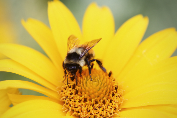
<img data-src="assets/flower_and_bee.jpg" data-elem="bg"/>
<img data-src="assets/bee_marker.png" class="marker" data-elem="marker" data-options="x:240; y:100; transformOrigin:50% 100%; maxZoom:1.5"/> <img data-src="assets/flower_marker.png" class="marker" data-elem="marker" data-options="x:450; y:260; transformOrigin:50% 100%; maxZoom:1.5"/>
<img data-src="assets/wings_marker.png" class="marker" data-elem="marker" data-options="x:250; y:100; transformOrigin:50% 100%; minZoom:1.6"/>
<img data-src="assets/legs_marker.png" class="marker" data-elem="marker" data-options="x:300; y:165; transformOrigin:50% 100%; minZoom:1.6"/>
<img data-src="assets/disk_marker.png" class="marker" data-elem="marker" data-options="x:280; y:270; transformOrigin:50% 100%; minZoom:1.6"/>
<img data-src="assets/petal_marker.png" class="marker" data-elem="marker" data-options="x:90; y:190; transformOrigin:50% 100%; minZoom:1.6"/>
</div>
</div>
<div data-elem="transformPreset" ></div> <div class="zoomHolder">
<div data-elem="pinchzoomer">
<img data-src="assets/flower_and_bee.jpg"/>
<img data-src="assets/bee_marker.png" class="marker" data-elem="marker" data-options="x:240; y:100; transformOrigin:cb; maxZoom:1.5"/>
<img data-src="assets/flower_marker.png" class="marker" data-elem="marker" data-options="x:450; y:260; transformOrigin:cb; maxZoom:1.5"/>
<img data-src="assets/wings_marker.png" class="marker" data-elem="marker" data-options="x:250; y:100; transformOrigin:cb; minZoom:1.6"/>
<img data-src="assets/legs_marker.png" class="marker" data-elem="marker" data-options="x:300; y:165; transformOrigin:cb; minZoom:1.6"/>
<img data-src="assets/disk_marker.png" class="marker" data-elem="marker" data-options="x:280; y:270; transformOrigin:cb; minZoom:1.6"/>
<img data-src="assets/petal_marker.png" class="marker" data-elem="marker" data-options="x:90; y:190; transformOrigin:cb; minZoom:1.6"/>
</div>
</div>
<link href="css/tooltipster.bundle.min.css" type="text/css" rel="stylesheet"/>
<script src="js/tooltipster.bundle.min.js" type="text/javascript"></script>
<link href="css/plugins/tooltipster/sideTip/themes/tooltipster-sideTip-shadow.min.css" type="text/css" rel="stylesheet" />
<img src="#" data-src="assets/image.jpg" data-elem="pinchzoomer" data-options="" />
<img src="#" data-src="assets/marker.png" class="marker tooltip" data-elem="marker" data-options="x:490; y:80;" data-tooltip="Simple text only"/>
<img src="#" data-src="assets/marker.png" class="marker" data-elem="marker" data-options="x:180; y:330" data-tooltip-html="<div>With HTML</div>"/>
<img src="#" data-src="assets/marker.png" class="marker" data-elem="marker" data-options="x:180; y:330" data-tooltip-html="#markerInfo"/>Somewhere in your HTML, define the content
<div style="display:none">
<div id="markerInfo"> This is using id reference </div>
</div>
<div class="zoomHolder">
   <div data-elem="pinchzoomer">
      <img id="streetLayer" data-src="assets/street_layer.jpg" data-elem="bg" class="layerImg"/>
      <img id="buildingLayer" data-src="assets/detail_layer.png" class="layerImg"/>
   </div>
</div>
It is possible that the images inside may affect the size of the content holder. This usually happens if the content's width and height is not set. To make sure the content holder has the correct size, images must be preloaded. To do this, the value of src attribute should be "#" and set the data-src attribute to the url of the image.
Below is how you add image options. Options set below will always show the zoom controls.<div class="zoomHolder"> <div data-elem="pinchzoomer">
<img id="streetLayer" src="#" data-src="assets/street_layer.jpg" data-elem="bg" class="layerImg"/> <img id="buildingLayer" src="#" data-src="assets/detail_layer.png" class="layerImg"/>
</div> </div>
On most websites, same images are loaded whether it is viewed on a desktop or a small screen device. The problem is that loading huge images especially on small screen devices will result to unnecessary load time, resources and lag. The solution for this is to deliver large version of the images for desktop and small images for small screen devices. Fortunately PinchZoomer has an adaptive image loader module that takes care of this task. Its main function is to load images based on the screen size of the user. Check out the steps below on how to set it up.
4.3.1. Add a div with data-elem="imageLoader" attribute with data-options="adaptive:true"
(Note: You can set this anywhere in the page)
<div data-elem="imageloader" data-options="adaptive:true"></div>In the data-options attribute you can also set these options below
| Option | Default Value | Description |
|---|---|---|
| loadDefaultOnFail | true | If true, if the adaptive image url fails to load, it will load the original url in data-src. If false, it will simply skip the image and move on to the next. |
| renameRule | folder | This is the rule on how to rename the url when using adaptive images. Possible values are "folder" and "name" "folder" value means it will prepend the breakpoint name so if the original url is "assets/image1.jpg" if the screen size is small the image url that will be loaded will now be "assets/small/image1.jpg" as for "name" it will append the breakpoint name so if the original url is "assets/image1.jpg" if the screen size is small the image url that will be loaded will now be "assets/image1_small.jpg" |
| maxConnections | 6 | This is the number of image requests at a time. |
| adaptive | false | If true this enables adaptive images |
4.3.2. Set custom breakpoints (OPTIONAL)
Breakpoints basically determine the image size that will be served to the users by comparing the users screen size to the breakpoint value. Below are the default breakpoints.
| Name | Value |
|---|---|
| small | 480 |
| medium | 960 |
| large | 1280 |
| Sample Screen Size | New Image URL |
|---|---|
| 400 x 300 | assets/small/image1.jpg |
| 800 x 600 | assets/medium/image1.jpg |
| 1024 x 768 | assets/medium/image1.jpg |
| 1280 x 800 | assets/large/image1.jpg |
| 1920 x 1080 | assets/large/image1.jpg |
<div data-elem="breakpoints" data-value="{name:phone; breakpoint:480}, {name:phablet; breakpoint:800}, {name:tablet; breakpoint:1280}, {name:desktop; breakpoint:1600}"></div>
Using the new custom breakpoints, the new image url will now look like
| Sample Screen Size | New Image URL |
|---|---|
| 400 x 300 | assets/phone/image1.jpg |
| 800 x 600 | assets/phablet/image1.jpg |
| 1024 x 768 | assets/phablet/image1.jpg |
| 1280 x 800 | assets/tablet/image1.jpg |
| 1920 x 1080 | assets/desktop/image1.jpg |
4.3.3. Set img src to "#" and set data-src with the original image url
The data-src must be set in order for PinchZoomer to recognize that you want this specific image to be adaptive. See example below
Without Adaptive Images
<div data-elem="pinchzoomer">
   <!-- this is the normal way of defining img -->
   <img src="assets/1.jpg"/>
   <img src="assets/2.jpg"/>
   <img src="assets/3.jpg"/>
</div>
<div data-elem="pinchzoomer">Note: You do not need to manually add data-src attribute for each image. If you already have the src attribute set, simply use the "Find and Replace" function in your text editor to set the data-src. So in your text editor find src= and replace it with src="#" data-src=.
<!-- this will load on demand at the same time will be adaptive if the 'adaptive' option is true -->
<img src="#" data-src="assets/1.jpg" />
<img src="#" data-src="assets/2.jpg" />
<img src="#" data-src="assets/3.jpg" /> </div>
4.3.4. Use a set of url in data-src (OPTIONAL)
As an alternative
way of setting adaptive images, you can specify in data-src a set of url instead of just one url. These urls represent each of the breakpoint. This is useful when file names are different or each version come from different sites and don't have control over the images.
<div data-elem="pinchzoomer">
   <!-- each url is separated by comma and the url set is enclosed by square brackets
        each represent a breakpoint so in this case small, medium and large -->
   <img src="#" data-src="[assets/small/1.jpg, http://somesite.com/1.jpg, reallybig/big_image1.jpg]" />
</div>
4.3.5. Set Image Size in CSS (OPTIONAL)
Since adaptive images delivers different image sizes on different screen sizes, it maybe necessary to set the width and height using CSS in order to make sure the images are displayed correctly on any screen. To make this easier, a HTML and CSS generator is provided which can be found here. This will generate the original width and height of the image in CSS and automatically add the class attribute of the image in HTML.
4.3.6. Add images for each breakpoint
PinchZoomer's apadtive image implementation does not include a way to generate different sizes for your original image. You need a 3rd party program such as FastStone Photo Resizer, an online tool like B.I.R.M.E or any other tool that will batch resize your images for you.
If your renameRule option is "folder"(default), you must create a folder for each breakpoint name and add the correct image with correct sizes to each folder. The file names must also be the same for each image version. For example you used the default breakpoints and have "assets/image1.jpg", you must also add "assets/small/image1.jpg", "assets/medium/image1.jpg" and "assets/large/image1.jpg"
If your renameRule option is "name", there is no need to create a folder for each breakpoint but you need to append the breakpoint name to the image files. For example you used the default breakpoints and have "assets/image1.jpg", you must also add "assets/image1_small.jpg", "assets/image1_medium.jpg" and "assets/image1_large.jpg"
4.4.1. Firefox(as of 66.0.2) on Windows 10 with Touchscreen
In order for the multi-touch gestures to work, the content must not exceed the height of the viewport. If your content is taller than the viewport(which is probably 99% of the case), you must wrap your content in a div. The maximum height of the div holder can only be 100% of the viewport. Not sure why this is the case but hopefully this will be fixed in the future. Below is the basic setup to make it work.
body,htmlHTML
{
margin:0px; height:100%;
} .contentHolder {
max-height:100%; overflow:auto;
-webkit-overflow-scrolling:touch; /* for ios momentum scrolling */ }
<div class="contentHolder">
   <!-- your content here -->
</div>
4.4.2. Safari and Chrome on iOS(12.1.4)
There is rendering issue on tooltips when markers are not hardware accelerated. Simply add in the data-options of the markers with tooltips. Note that only add this on markers with tooltips because this may slowdown the device when used to big images like in the multilayer zoom example. Check out the HTML below:
<img data-src="assets/marker.png" class="marker" data-elem="marker" data-options="x:240; y:100; " data-tooltip="A tooltip"/>
| jQuery function | Description |
| $(selector).pinchzoomer(optionsObj, parseControls) | this creates instances of PinchZoomer selector - defines which elements will have zoom function optionsObj - (default is an empty object) - this is the object containing the options (Check out section 3.4 for the options that can be set) parseControls - (default is true) if true, it will add the controls |
The simple example below shows how to use the jQuery plugin.
HTML
<div class="zoomHolder">
   <img id="pzImg" data-src="assets/easter_chick.jpg"/>
</div>
Javascript
/*
   This code will
   - use the image with "pzImg" id
   - set the initial options to maxZoom to 5 and scaleMode to "smart"
   - not add controls
*/
$("#pzImg").pinchzoomer({maxZoom:5, scaleMode:"smart"}, false);
| Static property | Description |
| objs : Array | array containing all the PinchZoomer objects. |
| transformPresets : Array | array containing all the marker transform presets |
| DRAG : String | holds event type "drag" |
| ELEM_CHANGE : String | holds event type "elemchange" |
| ELEM_HOLDER_CHANGE : String | holds event type "elemholderchange" |
| FULLSCREEN_TOGGLE : String | holds event type "fullscreentoggle" |
| GESTURE_END : String | holds event type "gestureend" |
| GESTURE_START : String | holds event type "gesturestart" |
| LOAD_COMPLETE : String | holds event type "resize" |
| ZOOM : String | holds event type "zoom" |
//access static propertiesBelow are the static functions of PinchZoomer
var objs = PinchZoomer.objs,
transformPresets = PinchZoomer.transformPresets;
| Static function | Description |
| get (idOrIndex) | returns PinchZoomer object given the id or index. The id parameter here is the id attribute of the element with PinchZoomer. |
| getTransformOrigin (idOrIndex) | returns animation preset given the preset id or index |
| init (elemsParam) | initialize and create instances of PinchZoomer
with the given elemsParam. If elemsParam is not defined, it will automatically look for elements with data-elem="pinchzoomer" and create PinchZoomer instances. This also works the same way as jQuery so you can do something like $(elemsParam).pinchzoomer(); |
| parseElem (elem, elemParent, vars, parseControls) | parses an element to create a PinchZoomer instance. elem is the element that will be parsed elemParent is the parent div of the element vars are the options/properties (see section 3.4 for list) parseControls accepts boolean value. If true, it will also parse controls. |
| remove (idOrIndex) | removes the PinchZoomer object given the id or index. |
//access static functions
var pz = PinchZoomer.get("pz1"), // "pz1" here is the id of the element with data-elem="pinchzoomer"
    transformPreset = PinchZoomer.getTransformOrigin("tp1"); // "tp1" is the id of the preset. See section 3.6.1 for details
PinchZoomer.remove("pz1"); // remove PinchZoomer instance given the id
| Public function | Description |
| addMarkers (newMarkers) | Adds markers in the PinchZoomer instance with the newMarkers parameter. newMarkers - allowed value is an array of Marker instances |
| elem (elem, removeOld, parseControls, overwriteVars) | if elem parameter is specified, it will replace the current element. If there are no parameters specified, it will return the current element. elem - element that will replace the current element removeOld - if true it will remove the old content if false it will just detach it. parseControls - if true, it will also parse and add controls overwriteVars - if true, this will overwrite the old options |
| elemHolder (newElemHolder) | if newElemHolder parameter is specified, it will replace the current div holder of the PinchZoomer instance to a new one. If there are no parameters specified, it will return the current div holder. newElemHolder - allowed value is a jQuery object |
| fullscreen (value) | if value is true, the PinchZoomer instance will go fullscreen mode. If false, it will return to normal |
| fullscreenToggle () | toggles fullscreen |
| load () | loads all the images with data-src in the PinchZoomer instance |
| markers (newMarkers) | replaces the markers with the newMarkers parameter or return array of markers if parameter is not specified newMarkers - allowed value is an array of Marker instances |
| off () | same as jQuery off function |
| on () | same as jQuery on function |
| one () | same as jQuery one function |
| resetElem (forceReset) | resets the element |
| transform (transformObj, duration) | accepts transformObj that can contain x, y and zoom values. duration - time in seconds to go to x and y position and also zoom |
| vars (varsParam) | sets new options for the PinchZoomer instance varsParam is an object that contains the option:value pair like { maxZoom:5, zoomStep:0.75 }. (Check out section 3.4 for the options that can be set) |
| x (value, duration) | if value is specified, it will set the x position of the content. If there are no parameters specified, it will return the x position. value- new x position duration - time in seconds to go to the new x position |
| y (value, duration) | if value is specified, it will set the y position of the content. If there are no parameters specified, it will return the y position. value- new y position duration - time in seconds to go to the new y position |
| zoom (value, duration) | if value is specified, it will set the zoom factor of the content. If there are no parameters specified, it will return the zoom factor. value- new zoom factor duration - time in seconds to go to the new zoom factor |
| zoomIn (duration) | zooms in content by the factor set in zoomStep option duration - time in seconds to go to the new zoom factor |
| zoomOut (duration) | zooms out content by the factor set in zoomStep option duration - time in seconds to go to the new zoom factor |
| zoomToMarker (markerTarget, zoomLevel, duration) | zooms and moves the markerTarget (which is the marker element) to the center. duration - time in seconds to go to the new zoom factor |
var pz = PinchZoomer.get("pz1"); // "pz1" here is the id of the element with data-elem="pinchzoomer"

//access public function example
pz.x(30); // set x to 30
var curX = pz.x(); // returns x

//add an event listener
pz.on(PinchZoomer.ZOOM, onZoom);
pz.zoom(2); // set zoom factor to 2x

function onZoom()
{
   var curZoom = pz.zoom(); // returns zoom factor
   console.log("ZOOM: " + curZoom);
}
Below are static properties of Marker. These properties are used for adding event listeners only.
| Static property | Description |
| UPDATE : String | holds event type "update" |
| ELEM_CHANGE : String | holds event type "elemchange" |
| Public function | Description |
| elem (elemParam) | sets the marker element with elemParam or returns the current marker element if parameter is not set |
| off () | same as jQuery off function |
| on () | same as jQuery on function |
| one () | same as jQuery one function |
| vars (varsParam, forceUpdate) | sets the marker options with varsParam or returns the current marker options if parameter is not set. varsParam is an object that contains the option:value pair like { transformOrigin:'100% 0%', maxZoom:2 }. (Check out section 3.6 for the options that can be set) forceUpdate - if true, it will instantly update the marker instance. |
var pz = PinchZoomer.get("pz1"), // "pz1" here is the id of the element with data-elem="pinchzoomer" is
    markers = pz.markers(), // return the array of markers
    firstMarker = markers[0]; // get first marker

//add event listener
firstMarker.on(Marker.UPDATE, onMarkerUpdate);

function onMarkerUpdate()
{
   console.log("MAKER UPDATE!");
}
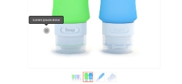
This example shows a how easy it is to convert PinchZoomer to a product gallery with thumbnails and hotspots using the API.
This shows how to integrate Masonry plugin with a fullscreen PinchZoomer gallery.
This example shows the events that are fired.
The example below shows how to add or remove PinchZoomer instances using the API.
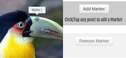
This example shows how to change options on the fly.
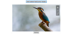
This example shows how to dynamically add or remove markers.